

Nice image from JBM. This sort of comparative perspective tends to rule out a lot of US-centric, highly contingent explanations for why things turned out as they did.
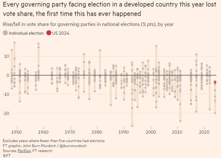

@kjhealy so the whole world is voting their wallets. At least, that's what I'm taking away from that graph.

This graph is about the continuing fall of neoliberalism as a world system. That makes it US-centric in the sense that the UK and US were the two historical centers of neoliberal ideology.

Interesting. Any chance this has something to do with the ultra wealthy / corporations being a global factor, with people like Musk and other oligarchs putting their finger on the scales? Or could this be something to do with environmental issues causing upheaval?
Maybe it's none of the above, but those are the first two that come to my mind.
Found the underlying connection! All governing parties in developed countries lost vote share because Starmer sent advisors to all of them.

I'm sure there are many takeaways from this, but for me it would suggest the lack of understanding from voters as to how things actually work.
Things have been bad, so change the government. There is no consideration of whether the government were at fault (as was the case in the UK) or not, or whether the new government might be better.
There has been a global crisis, hell there have been numerous global crises, national governments have not necessarily had the ability to fix that.

@adaliabooks Things are going bad, so blame the ppl in charge is actually not a bad strategy.
@kjhealy
But you also have to take into account what the alternatives are. Change isn't always better.
And a lot of the reasoning I've seen was that things were better when Trump was president last time, and sure they may have been. Because we hadn't had a global pandemic then, war in Ukraine hadn't driven fuel prices up.
Correlation does not equal causation.

@kjhealy General dissatisfaction with the status quo. Most people thinking things are getting worse. Lots of possible reasons for this perception.

@kjhealy Capitalism is eating itself and many of the people who are suffering the most are laboring under the delusion that they can decrease this suffering through the political processes of their respective countries. Things will get interesting if/when a significant number of them realize that they cannot do so.

@kjhealy too much money printed. Look up M1 money supply St Louis something.

@kjhealy two points here that are debatable:
1. That the Democrats were the governing party prior to the election
2. That the US remains a developed country


@kjhealy Super interesting data. I've heard a lot of pundits attributing the US election results to the "post COVID economic environment", with a particular emphasis on inflation. I'm sure there's quite a bit of truth to that, and it also had an impact around the world, which would explain why the results are seen so broadly. 1980, which is the last time we saw similar inflation, also seems to have been fairly hard on incumbents, with one obvious exception.
@kjhealy Or as Slate recently put it, "COVID took Donald Trump out of the White House—then, four years later, COVID put him back in." https://slate.com/news-and-politics/2024/11/election-results-2024-the-real-reason-kamala-harris-lost.html?via=rss

@kjhealy 1st world gov has separated the fake and the real worlds too far in uncountable ways, now the consequence is felt


@kjhealy wonder how much the misinformation campaigns in social media have driven this as well
@kjhealy Two overlapping underlying issues. Fear of refugees (significantly climate change driven) and the rise of monopolies.

@kjhealy Our current falloff pattern looks similar-ish to that for 2007–2011 (maybe even pushing it way back to '02).
Are we talking global crises here, then with 9/11 and its fallout and now with the pandemic?
And is that 1949–1954 (maybe to '57) falling off at the start? So, post-WW2.

@kjhealy This graph confirms my political views.

Haha. I think this might be the most on-point comment here.
Looking at the variance structure of the data prior to 2024, I'd guess the probability of getting a year like this purely by chance is quite high. Which means it's possible that this years results are completely meaningless.

@kjhealy That is incredibly interesting! Thanks for sharing.
Maybe the pain of post-covid (global) inflation was just felt too strongly by all the countries' electorates, and the governing parties simply couldn't say *anything* to offset that real-world, lived experience of significantly higher prices.

@kjhealy Fine Gael may be about to buck this trend

@kjhealy
But it doesn't look like a statistically significant change, so the firmness of the claim is questionable. It would help to see some p values on that
@ancientsounds Looks statistically significant to me. The average result this year is below -10. No other year comes close to that. In the whole of the timeline there only a small minority of datapoints are below -10.
@kjhealy
@BenAveling @ancientsounds @kjhealy
The variance on a per-election basis is large though. And we're not all the way through the year yet, so looking at the average this year is not really valid. All it would take is one election on the + side to make it look completely normal.
@BenAveling @ancientsounds @kjhealy
OTOH actually adding a line between the annual averages (if it's reasonable to average across countries of different sizes with different election processes) could be pretty interesting.
@naught101 @BenAveling @kjhealy
Exactly. Numbers, not eyeballing graphs, are needed to support such an inference. Perhaps the FT publishes them?
@ancientsounds @BenAveling @kjhealy
The data it's based on is availabe here: https://dataverse.harvard.edu/dataset.xhtml?persistentId=doi:10.7910/DVN/2VZ5ZC
But it's a bit of work just to get those differences out of it, by the looks
@naught101 Very nice! A lot of what you'd need is in the view_election tab, which can be downloaded as csv.
view_cabinet.tab looks like you could extract 'is in government' from it. There isn't a column for it, perhaps because it isn't always a simple thing to say, but you could approximate it.
You still have to work out how to join the two tables, but yeah, could be done.
@ancientsounds @kjhealy


@ancientsounds @kjhealy I’m confused, it looks like the claim is about (min, max) of the annual data set being entirely below 0. That’s not got a p value, unless the data is a smaller statistical sample of a potential whole dataset. But those dots claim to represent individual elections.
The probability that “(min, max) of the annual data set chosen is below 0” is 1 (bcs it's true of the graph), but the probability of the implied wider claim that this is significant, i.e. not just due to chance, is not stated; the year-on-year changes in the distributions could just be random, unless shown otherwise

@kjhealy impact of generally available GenAI?

@kjhealy Like many others have said, the fact that the swing was so small is the true wonder.

@kjhealy Voters everywhere blame the incumbent government for inflation, whoever the incumbent is. Not much more to it than that.

@kjhealy global version of "It's the economy, stupid"
@kjhealy So I'm trying not to get too depressed or scared. And this really helps. Harris' performance is at the top end of incumbents this year. The problem is Biden may well have been one of the greatest of presidents - bold and brave in rescuing the US economy after the COVID, and the Russian invasion shock. But the recovery is coming too late. Not enough people feel it. "Do I feel better off than I did 4 years ago?" Too many people didn't think so. It's the economy stupid. #uspol #USPolitics